The previous exercise asked to create a page with the following layout:
Header section
Large image goes here.
Smaller image
Smaller image
Smaller image
Footer section
The purpose being to try and use floating elements in a design.
Contents
An Example Using float
You can see how the page I styled and structured using float looks here.
Source Code
<!DOCTYPE HTML>
<html>
  <head>
    <title>Floating on Dreams</title>
    <meta charset="utf-8"  />

    <style>

      #title {
        font-size: 48px;
        text-align: center;
      }

      #subtitle {
        font-size: 24px;
        text-align: center;
      }

      .main {
        font-family: sans-serif;
        box-sizing: border-box;
        width: 960px;
        margin: auto;
      }

      .header {

      }

      .images {
      }

      .large-image {
          margin: auto;
      }

      .small-image-container {

      }

      .small-image {
          float: left;
          margin: 50px 10px 0 10px;
      }

      .footer {
          text-align: center;
      }

      .clearfix::after {
        clear: both;
        display: block;
        content: "";
      }

    </style>

  </head>
  <body>

    <div class="main">
      <div class="header">
        <p id="title">Floating on Dreams</p>
        <p id="subtitle">A simple page using floats</p>
      </div>

      <div class="images">
        <div class="large-image">
          <img src="28-big-image.jpg">
        </div>

        <div class="small-image-container clearfix">
          <div class="small-image">
            <img src="28-small-1.jpg">
          </div>
          <div class="small-image">
            <img src="28-small-2.jpg">
          </div>
          <div class="small-image">
            <img src="28-small-3.jpg">
          </div>
        </div>
      </div>

      <div class="footer">
        <p>Copyright 2018</p>
      </div>

    </div>

  </body>
</html>
Notes
- The first thing that needs to be done is to divide the document into nesting and stacking HTML blocks.
- This is one possible way to section the document:
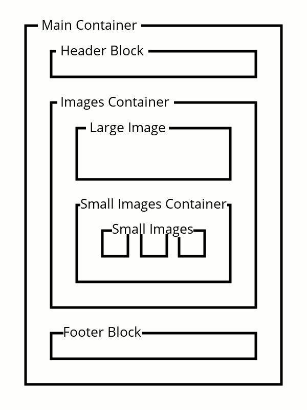
- There is always a Main container which contains all the content. It was set to have a width of 960 pixels.
- The Header and Footer blocks are nested inside the main container.
- Between the header and footer there is some content. The content (in this case) is images and is contained within an Images container.
- Nested inside the images container is a stacking of large and small images.
- The large image has its own container
- The small floating images are wrapped in their own container so they act like a single block. The small images block has .clearfix applied to it.
- Not all the sectioning divs have styling applied since their sole purpose is to provide structure.
- While styling could have been applied directly to the img tags, I chose to wrap them in a div because it allows for greater flexibility in the future.
- Imagine turning those small floating images into a “card”:

A Pensive Cat
- Imagine turning those small floating images into a “card”:
Image Credits
The images I used are courtesy of:
- charloisporto : Tranquil nature scene
- silviarita : Fruit salad
- Ataner007 : Woman meditating
- susannp4 : Cat