In this tutorial we are going to look at some best practices for the use of floating HTML elements.
Contents
- Divide the Page so Floats are in their own Block
- Float Everything in the Same Direction
- When You Want Floats to Overlap other Blocks
- float and box-sizing
- calc()
- Summary
- Playing Around
- References
Divide the Page so Floats are in their own Block
When you divide up a page, you want to ensure that floating elements are contained inside their own stacking block and .clearfix is applied to that block.
Notice how the 3 small floating images are in their own block, with other elements stacking above and below:
In general, you want to use floats to make elements flow horizontally inside a vertically stacking block.
As much as possible, avoid having floating elements actually floating on top of other elements – but there are exceptions.
Float Everything in the Same Direction
As a general rule, you should float all your elements in the same direction. For English language websites (or any other language that is written from left-to-right), you want to use float: left.
Everything Floating Left
Consider the following left floating elements which overflow and wrap:
While there is too much white space on the right side, the overall flow and alignment look fine.
Everything Floating Right
Consider the following right floating elements which overflow and wrap:
There is too much white space on the left side and the right alignment looks somewhat “unnatural” or out of place.
Floating to the right is a good choice for webpages written in languages written from right to left.1
Mixed Left and Right Floats
Consider the following floating elements which overflow and wrap. The left-most elements are floated left and the right-most element is floated to the right:
The way the content overflows doesn’t look quite right.
When You Want Floats to Overlap other Blocks
There are times when you want a floating element to overlap other blocks. The most common is getting text to flow around an image:
 Having text flow around an embedded image looks natural and is what most people would expect because this is a common layout style we find in books and magazines.
So this is one case where it makes sense to allow a floating image block to overlap with paragraph blocks.
Another common case is when you want to insert a side note or comment as a visible part of your content.
Consider the following (although you might want to justify the text to make it less ragged):
For example, you might be writing a document on the Tower of Pisa – which is more commonly known as the “Leaning Tower of Pisa”.
In the course of the article you will likely mention a number of facts about the tower. You might also want to mention something that doesn’t really belong in the main text, but is still a fun fact.
One way to do this would be to use a footnote or endnote. Another way, would be to insert it into the main text, but set it apart.
When you choose to deliberately overlap HTML blocks, you need to be careful about ensuring the floating element does not overlap blocks it shouldn’t.
float and box-sizing
Earlier, we saw the box-sizing property which instructs the User Agent (browser) to size HTML elements by either content area (default) or border. Recall the CSS box model:
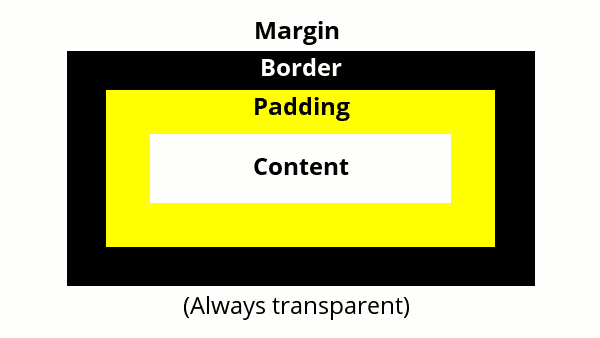
Sizing using the content-box does not include the padding, border, or margin when setting the size of the HTML element.
Sizing using the border-box includes the padding and border when setting the size of an HTML element. It does not include the margin in the size of the element.
For normal flow objects, this doesn’t make much difference to the layout since objects just flow downwards.
When we apply float to objects, they flow horizontally and will overflow and wrap around when they reach the edge of the browser – so we have to be more careful when specifying dimensions for floating objects. It is usually best to use box-sizing: border-box for floating HTML elements. Consider the following styling and code:
.parent {
  margin: auto;
  width: 300px;
  background-color: yellow;
}

.clearfix::after {
  clear: both;
  display: block;
  content: "";
}

.block {
  width: 100px;
  height: 50px;
  background-color: red;
  float:left;
}
<div class="parent clearfix">
<div class="block"></div>
<div class="block"></div>
<div class="block"></div>
</div>Which results in:
There is no obvious separation between one child block and another, since they all run together. The obvious solution is to insert a bit of space between them. We can do this by giving each child block a small margin (let’s say 10px all around):
Unfortunately, this causes the child blocks to overflow and wrap around. Remember:
- the parent container is 300px wide,
- each child is 100px wide,
- each child has a 10px margin,
- this makes each child block 100px + 10px + 10 px = 120px wide (there are 10px for the left margin and 10px for the right margin) and
- 50px + 10px + 10px = 70px high (there are 10px for the top margin and 10px for the bottom margin)
The height of the child blocks is not the problem for us, it is the width, so we can adjust our CSS to account for the 10px margin on the left and right of the child block:
Which gives us the result we would expect:
If we decide to add a border (even just a 1px border) or padding (even just 1px of padding), it will cause the elements to wrap (again).
We can compensate by subtracting the added widths of our border and padding, or we can set the box-sizing property to border-box:
Using the universal selector will cause all HTML elements to be sized according to their borders and not their content area. Personally, I think it is easier and more intuitive to work this way. When you layout the content on a page you imagine each block of content as being completely self contained – i.e., it includes the content, the padding around the content, and the border around the content. However, you do have to compensate for any margins you might use.
calc()
We’ve seen that % is a more convenient way of dimensioning floating elements than using pixels. If you want 3 equally sized columns you can make them each 33.33% of the width of the parent container. You could also make 2 of them 25% and one 50%. Unfortunately, this makes compensating for margins a bit trickier.
CSS has a function called calc() that makes this a lot easier. You simply enter the dimensions – even if they are different units – and calc() will perform the necessary calculation for you.
Taking the example above, we can write the CSS code for the blocks as follows:
.block {
  margin: 10px;
  width: calc(33.33% - 10px - 10px);
  height: 50px;
  background-color: red;
  float:left;
}
The width is set to 33.33% less 10px for the left margin and 10px for the right margin. It could have also been written as calc(33.33% – 20px), but I chose to explicitly subtract each margin independently for clarity.
Summary
- Divide the vertically stacking blocks
- Try to contain horizontally stacking blocks (floating elements) in their own vertically stacking block.
- As a general rules, you want all your floats to go in the same direction. In most cases this will be float: left. If you are developing webpages for a language that is written right-to-left, you will prefer [float: right]{css-property}
- Mixing float: left and float: right in the same containing block is, usually, a bad idea.
- Sometimes, you do want floating elements to overlap other blocks (like images, or side notes). In this case, you need to ensure appropriate overlapping.
- Setting your HTML elements to have box-sizing: border-box makes it easier to layout horizontally flowing elements, since it takes into account any border and padding values you set.
- Regardless of which box-sizing model you choose, you must always compensate for any margin values you apply.
- The CSS function calc() makes it easier to compute box sizes. It even allows mixing units (like pixels and % together).
Playing Around
Dividing Up a Page
Learning how to divide up a page layout into HTML block elements is crucial to being able to code that page.
- Explore a number of websites (news websites tend to be very good for this2) and pay attention to how the pages are laid out.
- How would you arrange the various HTML elements to create a similar layout?
- Which are the vertically flowing blocks?
- How are vertical elements nested inside of blocks?
- Can you code a page with a similar layout?
Many of these sites have very long pages. It is not necessary to replicate the entire page from top to bottom – just focus on the portion of the page you see in your browser window.
Don’t try to mimic all the functionality or behaviour. You haven’t learned to embed videos yet (just substitute a picture). There are effects (like shadows, animations, or dropdowns) that you haven’t learned either. Just focus on getting the general layout and look, more or less, right.
box-sizing and calc()
- Experiment with using box-sizing: border-box. You can do this by setting all HTML elements to have this property.
- Experiment using the calc() function.
You can use these with the page layouts you try out above.