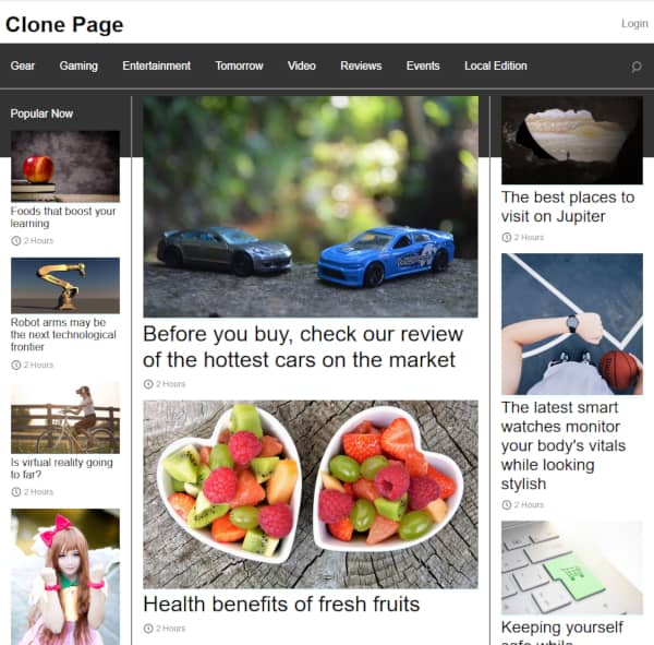
Taking what we know about float and creating a more sophisticated webpage layout.
Instead of creating our own layout, we will copy – more or less – an existing design.
It doesn’t have to be an exact copy.
Contents
The Objective
- Copy – more or less – the layout of the homepage of the website Engadget which can be done using float.
- Don’t clone the whole page, just the part that you see in your web browser without scrolling. In my browser window, Engadget looks something like this (I eliminated the ads from the page for simplicity):
 It might look different in your browser.
 - Don’t make the webpage functional – just go for the look. Creating clickable article links, a working navigation menu, search and login functions are beyond the scope of this exercise. This exercise is just about layout.
- Include a footer at the bottom.
Simplifications
To make things easier:
- Assume the articles in the central column are the same size instead being a large item on top and two smaller items beneath.
- Since the only fonts you know1 are serif, sans-serif, and monospace don’t worry about trying to match the fonts.2
A Tease of What It Could Look Like
Over the next two tutorials, I will develop code to create a page that looks like this:

This page is similar, but not identical, to the Engadget homepage.
Depending on your browser display width, the Engadget homepage may appear differently. For displays 960 pixels or wider, it should look similar.
- Fonts were covered in Nine More CSS Properties to Play With↩
- Future tutorials will cover how to specify other types of fonts, like: Times New Roman, Helvetica, Comic Sans, etc.↩