How does it do this and why does it seem to overlap other HTML elements?
Contents
- A Quick Review of Normal Flow
- float Takes the Element Out of Normal Flow
- float Changes the Element’s display Property
- How Floated Elements Position Themselves
- How Parents Interact with Floats
- Content Avoids Being Under a Float
- Clearing the Effect of Float
- How to Make a Parent Contain a Float
- Clearfix – The Better Way to Clear a Float
- Summary
- Playing Around
- References
A Quick Review of Normal Flow
All HTML elements have a box model:

All HTML elements are always represented as a rectangle.1
Elements can nest one inside the other:
We call the outer element a parent and the inner element a child.
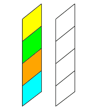
In HTML, block elements flow from top to bottom, stacking like blocks:
HTML Blocks
stack one
atop the
other
They stack or nest in the order they appear in the HTML document.2
The CSS Box expands to fit whatever is inside it – whether it is content or another CSS Box (which, technically, is content).
float Takes the Element Out of Normal Flow
When you apply the float property to an element, it takes the element out of normal flow.
We have always considered the HTML document to be like a flat sheet of paper. When we float an element, it is like adding another sheet of paper on top of the first:
And the floated element “floats” to that new layer:

Since it is no longer part of the original layer (normal flow), the block elements below move up as if the floated element never existed:
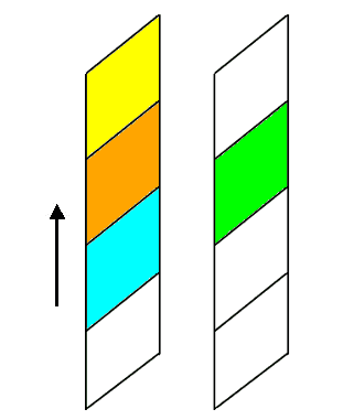
It is important to understand that the floated element is no longer fully contained inside the CSS Box it was declared. It literally floats on top of the other HTML elements.
Consider the following styling3 and code:
.box {
  width:300px;
  height: 150px;
  background-color: blue;
  margin: auto;
}

.floated-box {
  width: 150px;
  height: 300px;
  background-color: rgba(255, 0, 0, 0.5);
  float: left;
}Which results in:
If we switch the float from left to right we get:
In both cases, it should be obvious that the red element is floating above the blue element.
float Changes the Element’s display Property
All floated elements have a display of block.
This happens automatically.
You can set it to none to hide the floated element, but you cannot set it to inline or inline-block.4
How Floated Elements Position Themselves
A floating element’s position is bounded by its parent’s top and side edge, according to the following rules:
- It moves up as high as it can:
- it stops when it reaches the top of its parent (illustrated in the examples above) or
- it stops when it encounters an HTML element that is not floated:
Not floating.
- It moves as far to the left (or right – depending on the value of the float property) as it can:
- it stops when it encounters the corresponding side of its parent (illustrated in the examples above) or
- it stops when it encounters the side of another floated element
Floating
- Since it is removed from normal flow the parent knows nothing about the child, so the parent cannot automatically size to contain the floating child. Remember, the child is floating above the parent
- It is possible for a floating child’s CSS Box to be larger than its parent’s CSS Box:
How Parents Interact with Floats
Because floated elements are removed from normal flow they do not affect the parent.
Normally, a parent expands to contain all the content within it (assuming you haven’t set the width or height), but since a floated element is not contained by the parent, the parent cannot expand to contain it.
We see the parent and child in the examples above because I set the width and height or the parent element.
Consider the following in which the parent only has the background-color set:
Which results in:
Since the parent has no content (remember the floating child is outside normal flow), it has full width and a height of zero pixels (since there is nothing for it to expand around). You can convince yourself of this by adding a border to the parent element – which will appear as a horizontal line since the height it is zero pixels.
Adding some content to the previous example:
We get:
This is some text.
The parent container expanded to contain the content that was added, but it did not expand to contain the floating element.
Had I added the content before the float, the float would have stopped at the first non-float element and we wouldn’t have the dramatic effect of the float overflowing its parent and the parent not adjusting its size to contain the float.
This brings up another interesting property of floats: content avoids being under a float.
Content Avoids Being Under a FLoat
Consider the following code:
<div class="yellow-bg">
  <div class="floated-box"></div>
  <p>This is some text.</p>
</div>

<div class="lime-bg">
  <p>This is some text in a lime box.</p>
</div>

<div class="orange-bg">
  <p>This is some text in an orange box.</p>
</div>
Which gives the following result:
This is some text.
This shows that a float may overlap many CSS Boxes, but the content in those boxes are not covered by the floating element. In other words, content will never appear under a floating element.5
Floating elements never cover up content like this:
This is some text.
This behaviour makes floats extra confusing because the behaviour of things under a float is not consistent:
- CSS Boxes can be overlapped by floating elements
- Content in CSS Boxes cannot be overlapped by floating elements
Clearing the Effect of Float
The clear property is used to “restore” normal flow around a floated element. This is not technically correct, what really happens is the element is positioned under the bottom margin of the floating element. In other words, clear means something like: position yourself clear of the overlapping effect of any float.
There are 4 possible values:
- none : this is the default value and does not cause the element to get clear of any floats
- left : this causes the HTML element to position itself so it is clear of any float:left elements, i.e. no left floating element overlaps its CSS Box
- right : this causes the HTML element to position itself so it is clear of any float:right elements, i.e. no right floating element overlaps its CSS Box
- both : this causes the HTML element to position itself so it is clear of all floating elements, i.e. no floating element overlaps its CSS Box. This is the most commonly used value
The clear property is applied to the element you want to position immediately below the bottom margin of the floating element. Remember that HTML elements flow from top to bottom.
If clear is applied to an element that is not covered by a float, then it has no effect on its positioning.
Consider the previous example:
This is some text.
The red floating box overlaps the yellow, green, and orange HTML elements. Also notice that the content does not appear under the floating box.
The red box is a child of the yellow element. It was declared inside the yellow element and is bound to the top and left of the yellow element. But the yellow parent does not enclose its red child because the child is outside of normal flow, so the parent isn’t aware of it.
If we want the green element to appear after the floating red box (i.e., we want it to get clear of any overlapping by a float), we apply the following style to it:
And apply the class to our code:
<div class="yellow-bg">
  <div class="floated-box"></div>
  <p>This is some text.</p>
</div>

<div class="lime-bg clear">
  <p>This is some text in a lime box.</p>
</div>

<div class="orange-bg">
  <p>This is some text in an orange box.</p>
</div>
Which gives the following result:
This is some text.
clear:both has caused the green element to be positioned just beneath the bottom margin of the floated element. In other words, it got clear of the float. In this example, clear:left would have been good enough. Had we used clear:right, the green box would not have moved clear of the red box.
Had we also applied .clear to the orange box, it would have no effect because the orange box is no longer under the influence of the float.
How to Make a Parent Contain a Float
We saw that applying clear to an HTML element caused it to be positioned below the bottom margin of a floating element.
We can use the same technique to push down the bottom of a parent so it “contains” its floating child. Technically speaking, it doesn’t contain the child – it only looks like it contains the child.
It is useful to remember:
- floated elements are not part of normal flow.
- floated elements float on top of any normal flow CSS Boxes below them.
- floated elements move as far up as they can in their parent HTML element (this could be a div or even the body). They stop if they encounter a non-floating element.
- floated elements move as far to the side (left or right) as they can. They stop when they either encounter the side margin of the parent or of another float.
- Content never appears under a floating element. It will always shift to a position where it is not covered by a floating element.
- HTML elements expand (assuming no width or height has been set) to fit their content.
- we can set the clear property on an HTML element to tell it to position itself so it is clear of (not covered by) a floating element
Based on the behaviours outlined above, all that is needed to get a parent to “contain” a floating child is to:
- place an HTML element inside the parent,
- place it after the floating element,
- set the clear property on it.
This will cause the element to position itself after the floating element. Since this element is contained by the parent, the parent will expand to contain it:
<div class="yellow-bg">
  <div class="floated-box"></div>
  <p>This is some text.</p>
  <p class="clear">Clearing element under
    the float that expands the parent
  </p>
</div>

<div class="lime-bg">
  <p>This is some text in a lime box.</p>
</div>

<div class="orange-bg">
  <p>This is some text in an orange box.</p>
</div>
Which gives the following result:
This is some text.
Clearing element under the float that expands the parent
It works, except that we may not want to have text at the bottom of our parent. The trick is to insert a zero pixel high element – an empty div element works perfectly for this:
<div class="yellow-bg">
  <div class="floated-box"></div>
  <p>This is some text.</p>
  <div class="clear"></div>
</div>

<div class="lime-bg">
  <p>This is some text in a lime box.</p>
</div>

<div class="orange-bg">
  <p>This is some text in an orange box.</p>
</div>
Resulting in:
This is some text.
Which is exactly what we would like – almost.
The problem is that we have to insert some styled HTML code that does nothing but clear the effect of the float. Effectively, it is “noise” in our code.
Fortunately, there is a better way.
Clearfix – The Better Way to Clear a Float
The problem with the previous solution is that it adds extra code to get a parent to “wrap around” a floating child. It would be better if we didn’t have to add extra code.
There is a way to do this and it is known as .clearfix.6
The code looks like this (the class name is arbitrary, you are free to call it whatever you like):
It is applied to the parent containing the floating element:
<div class="yellow-bg clearfix">
  <div class="floated-box"></div>
  <p>This is some text.</p>
</div>

<div class="lime-bg">
  <p>This is some text in a lime box.</p>
</div>

<div class="orange-bg">
  <p>This is some text in an orange box.</p>
</div>
And gives us the result we want:
This is some text.
Breaking Down Clearfix
Unfortunately, .clearfix contains CSS elements I am not going to cover in this Front-End Basics tutorial series, but, understanding what is going on with .clearfix is important, so I need to give you a little background on what is happening:
- ::after – this creates a pseudo-element that is inserted as the last child. In other words, it creates a “fake” HTML element that becomes the last child of the parent. In effect, it automatically inserts the needed last HTML element for us.7
- clear:both – this instructs the pseudo-element (which is also the last element) to get clear of any floats. This means the pseudo-element will appear below any floats, thus extending the parent CSS Box around it (because it is contained by the parent).
- display:block – the pseudo-element display type is set to block style because normal flow (pretty much) relies on HTML elements being blocks.
- content – the content property allows inserting content into the ::after pseudo-element. In fact, there is no other way to insert content.8 In this case, we insert an empty string – it occupies no space, so the element has a height of zero pixels. If you omit the content property. then the .clearfix won’t work. Instead of an empty string, you could also use a single space ” “.9
Summary
- Floated elements are not part of normal flow.
- block elements move up to fill the space left by the floated element.
- Floated elements automatically have their display value set to block
- Floated elements “float up” to a display layer above the document layer.
- Floated elements cover any normal flow CSS Box elements below them.
- Floated elements first move up as far as they can in their parent HTML element. They stop when they reach the top margin of their parent or the bottom margin of a non-floating element.
- Floated elements then move as far to the side (left or right) as they can in their parent HTML element. They stop when they reach the side margin of the parent or of another floating element.
- Floated elements are not contained inside their parents, so the parent element does not expand to contain the floating element. (But they are bounded by the top and one side of the parent.)
- The CSS Box of a floating child element can be larger than the CSS Box of its parent.
- the bottom of a floating element can extend below the bottom of its parent.
- left floated elements can have their right margin extend past the right margin of their parent.
- right floated elements can have their left margin extend past the left margin of their parent.
- Content never appears under a floating element. It will always shift to a position where it is not covered by a floating element.
- The clear property does not stop or end the effect of a floating element.
- Setting clear:left on an HTML element instructs the element to position itself immediately below any float:left elements it may be affected by. If the element is not under the influence of any float:left element, this setting has no effect.
- Setting clear:right on an HTML element instructs the element to position itself immediately below any float:right elements it may be affected by. If the element is not under the influence of any float:right element, this setting has no effect.
- Setting clear:both on an HTML element instructs the element to position itself immediately below any floating elements it may be affected by. If the element is not under the influence of any floating elements, this setting has no effect.
- Inserting a “dummy” HTML block as the last element in a parent with the clear property set will cause the parent to expand and “contain” any floating children.
- .clearfix is the preferred method for getting a parent to “contain” floating child elements.
We covered quite a lot of material and information on float, but don’t worry, there is still plenty more in the next tutorial.
Playing Around
The best way to learn is to play around with what you have learned.
Floats can be confusing because they are removed from normal flow and can overlap other CSS Boxes, but the content in those boxes will not be overlapped – it will be positioned so it is not under a floating element.
For these exercises, I suggest making things simple by:
- using fixed sized boxes with different coloured backgrounds.
- make the background of floating elements semi-transparent using the RGBA() function so you can see when it floats over other HTML elements.
- Observing the effect of floats being removed from normal flow:
- Create two stacked (not nested) boxes and observe what happens when you:
- float the bottom box to the right?
- float the bottom box to the left?
- float the top box to the right?
- float the top box to the left?
- Create four stacked (not nested) boxes and what happens when you:
- float the second from the top to the right?
- float the second from the top to the left?
- Create two stacked (not nested) boxes and observe what happens when you:
- Observing the effect of clear on floats:
- Create three stacked (not nested) boxes. Make the second box twice as tall as the first box. Make the third box very wide. Float the first box left and the second box right and observe what happens when:
- clear:left is applied to the third box?
- clear:right is applied to the third box?
- clear:both is applied to the third box?
- Create three stacked (not nested) boxes. Make the second box twice as tall as the first box. Make the third box very wide. Float the first box left and the second box right and observe what happens when:
- Observing that parents do not contain their floating children:
- Create a parent container with no specified width and height, but let it have a background-color
- create a floating child box inside that is smaller than the parent. Do you observe the parent background-color?
- add a border to the parent. Do you observe the border, but not the background-color?
- what do you observe when you add non-floating elements to the parent? Try adding them before and after the floating child.
- Create a parent container with no specified width and height, but let it have a background-color
- Observing the effect of floats on content:
- Create a parent box with a specified width and height. Inside, create a floating box. The floating box should have a width and height greater than its parent. Beneath the floating box, add some text content (it is a good idea to put a border around the content) and observe what happens when:
- float is set to none?
- float is set to left or right?
- Create a parent box with a specified width and height. Inside, create a floating box. The floating box should have a width and height greater than its parent. Beneath the floating box, add some text content (it is a good idea to put a border around the content) and observe what happens when:
- Observing the positioning of multiple floats:
- Create a stack of three floating boxes. What happens when:
- they all have float set to left?
- they all have float set to right?
- Create a stack of three floating boxes. What happens when:
References
- If the width and height are the same, then it will be a square – a special case of a rectangle – but it will never be a circle or triangle or any other shape.↩
- In future tutorials you will see that it is possible to rearrange the content using either JavaScript or certain features of CSS3.↩
- I’m using RGBA, which allows you to specify the color and its opacity. Opacity is a fancy way of saying how see-through a colour is. For RGBA, it is a value between 0.0 (fully transparent) and 1.0 (fully opaque – solid).There is a hexadecimal version: #RRGGBBAA. The AA value goes between 00 (full transparency) to FF (full opacity). It is a recent addition to the CSS specification and may not be supported by all browsers (especially older ones), so RGBA is a safer bet. You can also use the shorthand form #RGBA if the two digits of each colour are the same – #3F7A is the same as #33FF77AAThe A stands for alpha channel, which is the standard name for opacity or transparency.↩
- There are more display modes than inline, inline-block, block or none – we haven’t seen yet. You can change the display value to some of those, but the upshot is: whatever you change it to, it must behave in a block like manner.↩
- If you force a float to completely overlap a CSS Box, the content will be pushed outside the boundaries of the float.↩
- Probably, the earliest reference to this fix is from Aug 15, 2002. Unfortunately, the fix, as described doesn’t work because it is applied to the floating element.↩
- Before CSS3, it was written :after (a single colon), but in CSS3, the correct way to write it is ::after (with two colons).↩
- You can use JavaScript to insert content.↩
- Some older browsers had a bug that would not correctly display the empty string, but would if it was a single space. Another alternative is to set the font-size and height to 0.↩