Every complicated task needs to be broken down into smaller, simpler tasks.
Here we define the general structure before filling in the details in the next tutorial.
Contents
Deciding on the Overall Structure
When we examine the engadget website:
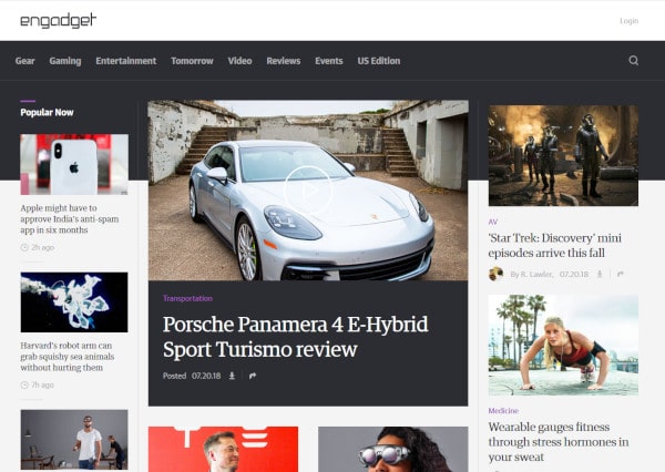
we see that its general structure looks something like this:
It consists of 6 rectangles:
- 2 stacked one atop the other at the top
- 3 stacked side-by-side in the middle
- 1 at the bottom of the page
It should be obvious that the 3 side-by-side columns are positioned using float.
Estimating the columns widths, it looks like:
- the narrowest column occupies about 20% of the display
- the widest column occupies about 50% of the display
- this leaves 30% for the medium width column
This is a rough guess, but it is a starting point. As we refine the page, we may adjust the relative widths of the columns to make the layout appear more pleasing.
I will make the content section 960px wide.1 I previously mentioned that 960px is a good rule of thumb for the content width of a webpage2
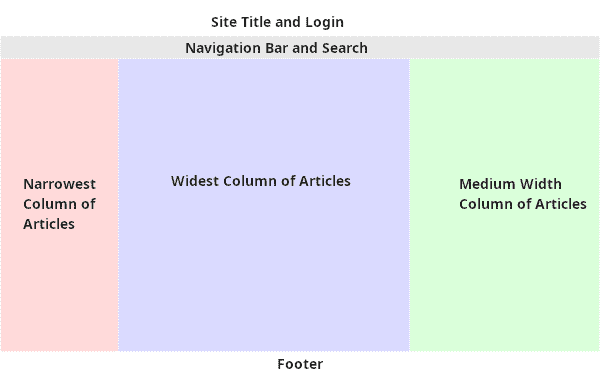
A Skeleton to Work With
A rough page skeleton might look something like this:
<!DOCTYPE HTML>
<html>
  <head>
    <title>Rough Layout</title>
    <meta charset="utf-8"  />

    <style>

      #wrapper {
        width: 960px;
        margin: auto;
      }

      #title {
        background-color: white;
        color: black;
        width: 100%;
      }

      #navbar {
        background-color: black;
        color: white;
        width: 100%;
      }

      #content {
        width: 100%;
      }

      #footer {
        width: 100%;
      }

      .column-left {
        width: 20%;
        float: left;
      }

      .column-middle {
        width: 50%;
        float: left;
      }

      .column-right {
        width: 30%;
        float: left;
      }

      .clearfix::after {
        clear: both;
        display: block;
        content: "";
      }

    </style>
  </head>
  <body>
    <div id="wrapper">
      <div id="title">Title and Login</div>
      <div id="navbar">Navigation Bar and Search</div>
      <div id="content" class="clearfix">
        <div class="column-left">Narrowest Column</div>
        <div class="column-middle">Widest Column</div>
        <div class="column-right">Medium Width Column</div>
      </div>
      <div id="footer">The Footer</div>
    </div>

  </body>
</html>
The rough layout consists of 5 ID styles and 4 class styles.
ID Styles in More Detail
If you remember, each ID must be unique3 on the page and each HTML element can have only one ID.4
IDs are used to refer to elements that the should only ever be one of on the page.
#wrapper
Because we are restricting the content width to 960px, we need to wrap all the content in a container that is 960px wide. We also set the margin to auto so the browser will automatically horizontally center the container in the browser window.5
All other elements are styled to occupy the full width of the #wrapper by setting their width to 100%.6 By using percentages for all other element dimensions, we can change the content width by altering a single value in #wrapper instead of having to change it everywhere we use px.
#title
There should only be one title section on a page. We set the background to white (but you can make it any colour you like, you can be creative in your reimagining of the page).
#navbar
There should be only one navbar on a page. The background is set to black (but you can make it a different colour if you like). The text colour is set to white so it contrasts against the black background.
#content
There should be only one content section (even if though it contains 3 columns).
#footer
There should be only one footer on a page.
Class Styles in More Detail
.column
.column-left {
  width: 20%;
  float: left;
}

.column-middle {
  width: 50%;
  float: left;
}

.column-right {
  width: 30%;
  float: left;
}
Because we have 3 unique columns, they could have been made IDs. I decided to make them classes because if I decide to go with a 4 column or 5 column layout, I might be able to reuse existing classes (I could have named the columns better).
They are all floated left and have their widths set as a percentage totaling 100%.
.clearfix
The clearfix for the #content could have been written as:
But, we may find ourselves using float in more places as we refine the page, so it is better to have it as a generic clearfix that can be applied as needed.
The HTML in More Detail
<body>
  <div id="wrapper">
    <div id="title">Title and Login</div>
    <div id="navbar">Navigation Bar and Search</div>
    <div id="content" class="clearfix">
      <div class="column-left">Narrowest Column</div>
      <div class="column-middle">Widest Column</div>
      <div class="column-right">Medium Width Column</div>
    </div>
    <div id="footer">The Footer</div>
  </div>

</body>
It should be straightforward:
- the #wrapper encloses all the other html
- the #title, #navbar, #content, and #footer stack one atop the other in normal flow
- the columns are left floated inside the #content
Cards
Having completed the basic structure, we can now focus on some of the internal details.
Each column contains a number of stacked cards containing information about the article. Each card contains:
- An image
- A title
- A timestamp
The HTML should look something like this:
<div class="card">
  <div class="image">
    <img>
  </div>
  <div class="headline"></div>
  <div class="timestamp"></div>
</div>
It should be straightforward:
- a card consists of a wrapper which I call card
- inside the card wrapper we have the image, the article headline, and the timestamp
- the actual image is placed inside an image container because the image only has a single tag and it is easier to manipulate if we place it inside a div element.7
And with some styling it could look something like this:

- If you are curious, the engadget content is 1275px wide. The narrowest column is 255px, the widest column is 680px, and the medium width column is 340px. Corresponding to column widths of 20%, 53.3%, and 26.7% respectively.↩
- See note 4 in the tutorial CSS – Understanding How Float Works – Part 2. It’s a good rule of thumb for desktop webpages because it will render correctly on most desktop browsers.↩
- This was covered in the article CSS – Selecting Specific Elements for Styling.↩
- This was mentioned in a footnote in the article CSS – Selecting Specific Elements for Styling.↩
- Of course, if the browser window is narrower than 960px the page will overflow the browser window – the likely result being a horizontal scroll bar. In future tutorials, we will see how to dynamically adjust the page width and layout to fit different browser window widths. This is known as Responsive Web Design↩
- Using percentage as a width value was discussed in ↩
- This is a common design style: start with the largest structures and nest things inside until we get to the individual elements. It may seem unnecessary, but it makes for easier maintainability. Remember, div has no semantic meaning, it only provides structure. See Sectioning Using HTML and Auto Centering Content↩