A detailed walk through the code.
Contents
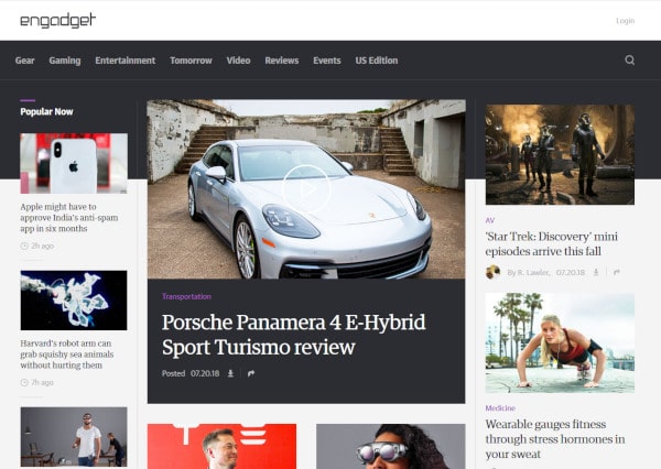
The Final Page
You can see the finished page here.
It is best viewed in a browser window that is 960px wide or larger.
Source Code
<!DOCTYPE HTML>
<html>
  <head>
    <title>Clone Page</title>
    <meta charset="utf-8"  />

    <style>

      * {
        box-sizing: border-box;
        font-family: sans-serif;
        font-size: 16px;
      }

      img {
        width: 100%;
      }

      #wrapper {
        width: 960px;
        margin: auto;
      }

      #title {
        background-color: white;
        color: black;
        padding: 8px;
      }

      #site-name {
        font-size: 32px;
        font-weight: bold;
      }

      #login {
        color: grey;
        padding-top: 8px;
        float: right;
      }

      #search {
        color: grey;
        float: right;
        padding-top: 18px;
        padding-right: 16px;
        font-size: 24px;
      }

      #navbar {
        background-color: #333333;
        color: white;
        border-bottom: 2px solid grey;
      }

      #darkbox {
        background-color: #333333;
        height: 100px;
      }

      #content {
        margin-top: -90px;
      }

      #popular {
        color: white;
        padding-left: 16px;
        font-weight: bold;
      }

      #footer {
        text-align: center;
        padding: 24px;
        background: #333333;
        color: white;
        font-size: 20px;
      }

      .nav-item {
        display: inline-block;
        padding: 24px 16px;
      }

      .column-left {
        width: 20%;
        float: left;
      }

      .column-middle {
        width: 55%;
        float: left;
        border-left: 2px solid grey;
        border-right: 2px solid grey;
      }

      .column-right {
        width: 25%;
        float: left;
      }

      .clearfix::after {
        clear: both;
        display: block;
        content: "";
      }

      .card {
        padding: 0 16px 16px 16px;
      }

      .image {

      }

      .headline-small {

      }

      .headline-medium {
        font-size: 24px;
      }

      .headline-large {
        font-size: 32px;
      }

      .timestamp {
        padding-top: 8px;
        color: gray;
        font-size: 12px;
      }

    </style>
  </head>
  <body>
    <div id="wrapper">
      <div id="title">
        <span id="site-name">clonage</span>
        <span id="login" class="clearfix">Login</span>
      </div>
      <div id="navbar">
        <span class=nav-item>Gear</span>
        <span class=nav-item>Gaming</span>
        <span class=nav-item>Entertainment</span>
        <span class=nav-item>Tomorrow</span>
        <span class=nav-item>Video</span>
        <span class=nav-item>Reviews</span>
        <span class=nav-item>Events</span>
        <span class=nav-item>Local Edition</span>
        <span id="search" class="clearfix">⌕</span>
      </div>
      <div id="darkbox"></div>
      <div id="content" class="clearfix">
        <div class="column-left">
          <p id="popular">Popular Now</p>
          <div class="card">
            <div class="image">
              <img src="32-small-1.jpg">
            </div>
            <div class="headline-small">
              Foods that boost your learning
            </div>
            <div class="timestamp">🕔 2 Hours</div>
          </div>
          <div class="card">
            <div class="image">
              <img src="32-small-2.jpg">
            </div>
            <div class="headline-small">
              Robot arms may be the next
              technological frontier
            </div>
            <div class="timestamp">🕔 2 Hours</div>
          </div>
          <div class="card">
            <div class="image">
              <img src="32-small-3.jpg">
            </div>
            <div class="headline-small">
              Is virtual reality going to far?
            </div>
            <div class="timestamp">🕔 2 Hours</div>
          </div>
          <div class="card">
            <div class="image">
              <img src="32-small-4.jpg">
            </div>
            <div class="headline-small">
              The latest trends in cosplay
            </div>
            <div class="timestamp">🕔 2 Hours</div>
          </div>

        </div>
        <div class="column-middle">
          <div class="card">
            <div class="image">
              <img src="32-big-1.jpg">
            </div>
            <div class="headline-large">
              Before you buy, check our review of the
              hottest cars on the market
            </div>
            <div class="timestamp">🕔 2 Hours</div>
          </div>
          <div class="card">
            <div class="image">
              <img src="32-big-2.jpg">
            </div>
            <div class="headline-large">
              Health benefits of fresh fruits
            </div>
            <div class="timestamp">🕔 2 Hours</div>
          </div>
        </div>
        <div class="column-right">
          <div class="card">
            <div class="image">
              <img src="32-medium-1.jpg">
            </div>
            <div class="headline-medium">
              The best places to visit on Jupiter
            </div>
            <div class="timestamp">🕔 2 Hours</div>
          </div>
          <div class="card">
            <div class="image">
              <img src="32-medium-2.jpg">
            </div>
            <div class="headline-medium">
              The latest smart watches monitor your
              body's vitals while looking stylish
            </div>
            <div class="timestamp">🕔 2 Hours</div>
          </div>
          <div class="card">
            <div class="image">
              <img src="32-medium-3.jpg">
            </div>
            <div class="headline-medium">
              Keeping yourself safe while shopping online
            </div>
            <div class="timestamp">🕔 2 Hours</div>
          </div>
        </div>
      </div>
      <div id="footer">Copyright 2018</div>
    </div>

  </body>
</html>
Detailed Code Walkthrough
Setting Some Page Level Defaults
The box-sizing property1 is set to border-box – instead of the default content-box – for all elements. You almost always want to do this because it makes layout much easier.
The font-family is set to sans-serif, but you are free to choose serif or monospace.2
The font-size is set to 16px. This is the default value for almost all web browsers.
These settings will be applied to all the HTML elements unless overridden by more specific styling.3
The Highest Level Structure
When writing the code, it became obvious that another element – which I call darkbox – was needed below the navbar.
It didn’t have to be added to the high level structure, it could have been nested inside the navbar – but it seemed simpler this way.
At the highest level, the (new) HTML structure looks like this:
<body>
  <div id="wrapper">
    <div id="title"></div>
    <div id="navbar"></div>
    <div id="darkbox"></div>
    <div id="content" class="clearfix">
      <div class="column-left"></div>
      <div class="column-middle"></div>
      <div class="column-right"></div>
    </div>
    <div id="footer"></div>
  </div>
</body>
As we walk through the code, it should become clear why it was added.
The Wrapper
The standard way of laying out a webpage is to add a content wrapper between the body tags rather than directly adding content to the body section of the document.
There is no change from the design decision to make the content 960px wide and to center it inside the body section by setting the margins to auto:
The Title
<div id="title">
  <span id="site-name">clonage</span>
  <span id="login" class="clearfix">Login</span>
</div>
The Title section consists of a single line with two parts:
- the site title
- the login
The span tag is used to style elements in a line.4
We want one element to be to the left and one to the right. This can be accomplished by floating the login to the right.5
A .clearfix is applied to the final element to remove the effect of the float.6
Some basic properties are set for the title area:
- background colour,
- text colour,
- and a little bit of padding to make it look nice.
To make the site name stand out, the font size is set to 32px and made bold. You could also make the site name an image – this would allow you to use a logo as well.
The title could be floated to the left, but it left justifies automatically, so it is unnecessary. You can add float:left to the class – if you want.
The login is subdued compared to the surrounding text, so it was set to grey instead of black. A custom hexadecimal RGB value could be used as well.
8px of padding was added to the top to vertically align the login text with the site name.7 If you wanted to adjust the margin instead of the padding, then the display mode of the span must be changed to inline-block.8
The HTML element was also floated to the right of the page.
The Navigation Bar
<div id="navbar">
  <span class=nav-item>Gear</span>
  <span class=nav-item>Gaming</span>
  <span class=nav-item>Entertainment</span>
  <span class=nav-item>Tomorrow</span>
  <span class=nav-item>Video</span>
  <span class=nav-item>Reviews</span>
  <span class=nav-item>Events</span>
  <span class=nav-item>Local Edition</span>
  <span id="search" class="clearfix">⌕</span>
</div>
Each menu or navigation item is enclosed inside a span element. This allows each item to be individually styled.9 Recall that HTML eliminates all excess whitespace characters.10
The element containing the “search” icon is given the id search since there should be only one search item on the page. It is floated to the right. A suitably sized image of a magnifying glass could have been used, instead similar looking text character is used instead – it is a “telephone recorder” (⌕). This simplifies everything by keeping everything text instead of mixing text and images (not that there is anything wrong with doing that). Finally, the .clearfix is applied to clear the float.
The background is dark, but not black. A thin border is set on the bottom.
Each .nav-item has display set to inline-block. This allows us full control of the margins (including the top and bottom).
The padding is set to something I considered pleasing looking.
The search element is floated to the right. The colour is a more muted and set to grey. Because the “telephone recorder” is a bit small, the font-size was increased to 24 px. This required adjusting the top padding to make it look centred.
The Dark Box
This is the trickiest element and requires a bit of lateral thinking.
If you look at the original page layout, you see the columns overlap a dark region above them. You also notice that there is a vertical line dividing the columns and a horizontal line dividing the navigation bar from the columns:11
The horizontal dividing line is made by setting the border-bottom of the navbar container to something visible.
Placing an identically coloured element below the navigation bar, it looks like there is a horizontal line dividing the dark region into a top and bottom.
The darkbox is an empty div with some height applied.
Perhaps a better name would be navbar-extension instead of darkbox.
The background-color is set the same as for the navbar.
A height of 100px looks about the right size.
The Content
<div id="content" class="clearfix">
  <div class="column-left"></div>
  <div class="column-middle"></div>
  <div class="column-right"></div>
</div>
The content is a container holding three left floating columns. It is styled with .clearfix to restore normal flow. The .clearfix could be applied only to .column-right, but it seems better to clear at the parent container level.
The margin-top is set to -90px. This causes the content area to be shifted upwards 90px. This causes it to overlap the darkbox. It is possible to use negative values for positioning elements.
The column-left
The .column-left contains the title Popular and 4 cards.
<div class="column-left">
  <p id="popular">Popular Now</p>
  <div class="card">  </div>
  <div class="card">  </div>
  <div class="card">  </div>
  <div class="card">  </div>
</div>
The .column-left is styled to have a width of 20% and to float left.
The Popular title is styled using the #popular class which sets the text color to white, adds 16px of padding-left to nicely align the title and set the font-weight to bold so it stands out.
We will examine the details of the .card class a little later.
The column-middle
The .column-middle consists of two cards.
If you wanted to be more like the Verge website, which has a single large card and then two columns of cards beneath it, the code would look something like this this:
<div class="column-middle">
  <div class="card">  </div>
  <div class="dual-columns">
    <div class="dual-left">
      <div class="card">  </div>
      <div class="card">  </div>
      <div class="card">  </div>
    </div>
    <div class="dual-right">
      <div class="card">  </div>
      <div class="card">  </div>
      <div class="card">  </div>
    </div>
  </div>
</div>
There might be better class names or you might want to use IDs instead of classes.
The .column-middle is styled to have a width of 55% and to float left. It also has a thin border on the left and right side – this gives a nice visual esthetic. How could you make these vertical borders touch the horizontal border applied to the #navbar?12
.column-middle {
  width: 55%;
  float: left;
  border-left: 2px solid grey;
  border-right: 2px solid grey;
}
The column-right
The .column-right consists of three cards.
<div class="column-right">
  <div class="card">  </div>
  <div class="card">  </div>
  <div class="card">  </div>
</div>
The .column-right is styled to have a width of 25% and to float left.
The card
A .card encapsulates an:
- image,
- headline,
- and timestamp .
<div class="card">
  <div class="image">
    <img src="image.jpg">
  </div>
  <div class="headline">
    A Headline
  </div>
  <div class="timestamp">🕔 A Timestamp</div>
</div>
The img is wrapped inside a div. This is common practice.13 It allows the image and everything associated with the image to be encapsulated in its own container.
The headline contains some text. It could be wrapped inside a p tag, but it is not necessary.
The timestamp also contains some – which also could be wrapped inside a p tag. The clock (🕔) could be an image, but there are some Unicode clock characters14 – which what is used. It is easier to work with text instead of mixing text and images. However, whatever gets the job done is (usually) good.
The .card is styled to have 16px of padding on the left, right, and bottom. This padding allows the card to have some esthetic spacing on the sides and between cards. If 16px of padding were also applied to the top, then there would be 32px of spacing between the bottom of one card and the top of the next card.
The img tag is styled with a width of 100%. This causes the image scale correctly to fit whatever container it is in – the same .card is used in all the columns (20%, 55%, and 25%).15
The wrapper for the [img]{html-tag} has the class .image applied to it. At the moment, it doesn’t apply any styling, but it is available for modification in the future.16
The footer
The footer has its own ID and is styled to match the rest of the content on the page.
Final Thoughts
Using only what we’ve covered so far, it is possible to create quite sophisticated looking webpages.
You can go a step further and make the page “functional” by adding links to all the articles17 and creating the corresponding pages.
While it is a lot of work to create a webpage, it is not difficult work.
I encourage you to try and “clone” webpages from other sites. Remember, the goal is to practice and hone your skills, not to wear yourself out.
There is still a lot more to developing webpages and websites. Responsiveness[^responsive] is an important one: your webpage should look good on a 320px X 480px phone display as on a 1920px X 1080px desktop display. But this is something you don’t worry about in the beginning. First get the skills down to make pages that look good on the screen you are working on. In future lessons, we will look at how to make the page look good on varying display sizes.
Image Credits
The images used in the example page are courtesy of:
- Apple and Books by jarmoluk
- Robotic Arm by PIRO4D
- Virtual Reality Cyclist by VR Pexels
- Cosplay Girl by ptksgc
- Toy Cars by kamal1118
- Fruit Salad by silviarita
- Astronaut and Jupiter by DasWortgewand
- Watch by the5th
- Keyboard by atthree23
- This was covered in None More CSS Properties to Play With↩
- A future tutorial will show how to use specific fonts like: Arial, Courier, Times New Roman, etc.↩
- A future tutorial will explore how CSS properties are applied when the same property is styled differently in multiple rules. This can happen when two or more classes are applied to the same element (or and ID and a class).↩
- This was covered in Sectioning Using HTML and Auto Centering Content. I could have floated the title to the left and the login to the right, but it wasn’t necessary. This is a design decision. You are free to float the title to the left.↩
- See CSS – Understanding How Float Works – Part 2↩
- See CSS – Understanding How Float Works – Part 1 for a discussion of clearfix.↩
- The site is set to 32px, and the default text size is set to 16px. This means the default text is 16px smaller than the site name. This is divided between the top and bottom of the login (or 8px on the top and 8px on the bottom). We know that floats move up as far as they can, so it is only necessary to add 8px of padding to the top. You can also use trial and error until it looks the way you want.↩
- This was discussed in HTML Flow and the CSS Box Model – the ‘Display’ Property↩
- It is more common to use an unordered list (ul) and make each element a list item (li). The list items are styled with display:inline instead of the default display:list-item. This requires using a property I haven’t discussed yet: list-style-type which controls what is displayed next to each list item. Some of the values are: disc, circle, square, none. If you want to use a list instead, then apply list-style-type:none to the unordered list.↩
- See HTML Basics – Conclusion↩
- OK, the lines are not so visible in the tiny little image I provide, but they are visible if you go to the engadget website.↩
- You move the content area up 100px – the full height of the #darkbox – instead of 90px. You then add a bit of padding (maybe 10px) to the top of the content area so there is some spacing between the content and the horizontal line.↩
- Common practices, are often called design patterns. A design pattern is a generic solution for problems that repeatedly come up in software engineering. There are many different types of design patterns.↩
- Some of the available Unicode time characters are:
⏰ – Alarm Clock
🕰 – Mantelpiece Clock
⌚ – Watch
⏱ – Stopwatch
⏲ – Timer
⌛ – Hourglass
⏳- Hourglass with flowing sand
⧗ – Black Hourglass
⧖ – White Hourglass
🕛 – 12:00
🕧 – 12:30
🕐 – 1:00
🕜 – 1:30
🕑 – 2:00
🕝 – 2:30
🕒 – 3:00
🕞 – 3:30
🕓 – 4:00
🕟 – 4:30
🕔 – 5:00
🕠 – 5:30
🕕 – 6:00
🕡 – 6:30
🕖 – 7:00
🕢 – 7:30
🕗 – 8:00
🕣 – 8:30
🕘 – 9:00
🕤 – 9:30
🕙 – 10:00
🕥 – 10:30
🕚 – 11:00
🕦 – 11:30
- This was covered in Nine More CSS Properties to Play With↩
- You could argue that if there is no styling being applied, the class .image shouldn’t exist. It is difficult to always know what is needed or what sort of changed might be made in the future. Having the class allows you to add a border or background colour. It is common to see unique empty classes applied to certain elements on a page for future styling. For example, you could add a unique paragraph class to each p:
This allows you to change the appearance of individual paragraphs at a future date without having to change the HTML code – just the CSS. This can be applied to images, or other blocks of text.↩
- There is complexity in adding links to the articles. By default, anchored text, has a different default colour from surrounding text, hovering a mouse over the link unlerlines the link, a previously visited link has a different colour. You can style the a tag, but the options are more restricted (for security reasons).When .clearfix was discussed, you saw the ::after pseudo element selector. CSS has other selectors as well. The most commonly used with anchor tags are: :hover for styling when the mouse is over the content and :visited which allows styling visited links. You are free to experiment with them now, but they will be covered in a future tutorial.
To disable underlining when hovering over a link, you would apply the following style: